Knowledge of color mixing options can be useful not only in the professional activities of artists. The individual design of living space often raises the question of how to achieve this or that interesting halftone before the designer. The proposed combination options and the color mixing table will help you get the desired effect.
Everyday life is filled with the widest range of all kinds of colors. To get the right one, you need to know the intricacies of combining.
Blue, red and yellow paint are three pillars on which a wide palette of halftones rests. It is impossible to form these colors as a result of mixing other colors. At the same time, their combination with each other gives an unusually many combinations.

Important! You can create a variety of shades by mixing only two colors by changing their proportions.
Depending on the volume of one part of the paint added to another, the resulting result approaches one or another original color. One of the most famous examples is the mixing of blue and yellow, resulting in green color. The result obtained by adding new portions of yellow paint will gradually change, as close as possible from green to yellow. You can return to blue by adding more of the original element to the green mixture.
Mixing chromatic colors that are close to each other on the color wheel gives a paint that does not have a pure tone, but has an expressive chromatic hue. Combining colors on opposite sides of the chromatic circle will result in an achromatic tone. An example is the combination of orange or magenta with green. That is, a mixture of colors closely spaced in the color wheel gives a rich chromatic hue, the maximum removal of colors from each other when mixed leads to a grayish tone.

Separate paints, when interacting, give an undesirable chemical reaction, which may result in cracking of the decorative layer. In some cases, the resulting background may darken or gray. A good example is a mixture of white lead and red cinnabar. Attractive pink color darkens over time.
It is optimal when the impression of multicolor is achieved by mixing the minimum number of colors. At the same time, it is important to consider which paints, as a result of mixing with each other, give a stable result, and which ones cannot be combined. The knowledge gained allows us to exclude from the work the paints that fade or darken in the future.
The table of undesirable mixtures below will help reduce the risk of erroneous combinations:
Having tried the above examples in practice, future painters and designers will gain valuable professional experience.
Methods for obtaining red and its shades
Red is one of the top three primary colors and is always present even in the smallest sets. But for mass printing, magenta tone is used. The answer to the question of how to get red is quite simple: mix the proposed magenta with yellow in a 1: 1 ratio. There are other options to get red when mixing paints:


In the center is the main red. Next are the mixing options. The next circle is the result of combining the first two colors. In conclusion, color options are presented when red, black or white paint is added to the final result.

Blue and its shades
Blue belongs to the primary colors, so blue paint is required to form all its shades.
Attention! No combination of other colors gives a shade of blue, so the presence of this paint in the kit is mandatory.
Even with a set of 12 colors available, the question periodically arises of how to get blue. The classic tone is called "royal", and in a set of acrylic paints, ultramarine color is often the main one, which has a bright dark tint with a purple undertone. To achieve a lighter effect, mixing blue and white in a ratio of 3: 1 allows. An increase in white leads to a lighter tone up to sky blue. If you want to achieve a moderately saturated result, dark blue paint is mixed with turquoise.
What colors need to be mixed to get shades of blue, consider below:
- The effect of a dark blue-green tone is achieved by mixing blue and yellow paint in equal proportions. The addition of white paint will result in a lighter hue with a simultaneous decrease in brightness due to the combination of 3 elements.
- Prussian blue is created by mixing 1 part of the main blue and adding 1 part of the composition of bright green and light green. A rich and deep shade can be diluted with white, and its purity will not change.
- The combination of blue and red in a ratio of 2:1 gives blue with a hint of purple. Adding white allows you to lighten a dark and saturated tone.
- The brightness of royal blue is different, a similar effect is achieved by mixing the main blue with magenta pink in equal parts. The admixture of white traditionally brightens the result.
- The combination with orange gives a gray mass. Replacing orange with brown at a ratio of 1:2 to the base creates a dark color with a complex gray-blue tint.
- The formation of dark blue is done with the help of black admixture in the ratio of 3:1.
- Mixing the base color with white allows you to create a blue tone on your own.
A small table of combination options is presented below:
green color palette
Solving the problem of how to get green in case it is not in the set is quite simple: connect yellow and blue. A rich palette of green halftones is created by changing the proportions of the original components and adding additional elements that perform the function of darkening or lightening. This role is played by black and white paint. The effect of olive and khaki is achieved by mixing the two main elements (yellow and blue) and a slight admixture of brown.
Comment! The saturation of green depends entirely on the quality of the constituent elements: the intense tones of the source guarantee a bright result.
If green is obtained by mixing, then all subsequent midtones will be dimmer. Therefore, it is better to experiment with a gamut of green, having an initially ready-made primary color. There are many combination options:
- The combination of equal proportions of blue and yellow gives grassy green.
- Increasing yellow to 2 parts with the addition of 1 part blue results in a yellow-green effect.
- Experimenting on the contrary in the form of a blue-yellow ratio of 2: 1 will produce a blue-green tone.
- If you add ½ of black to the previous composition, you will achieve a dark green effect.
- Light green warm tone is formed from yellow, blue and white paint in a ratio of 1:1:2.
- For a similar light green shade, but a cold tone, you need to take yellow, blue and white bases in a ratio of 1:2:2.
- Dark olive color is formed by mixing in equal parts yellow, blue and brown paint.
- A gray-brown tone is obtained from similar elements in a ratio of 1: 2: 0.5.
The expressiveness of the green color is directly dependent on the original elements, respectively, the brightness of the midtones is repelled by the saturation of the green. A visual representation of the blending options is given by the graphic palette:
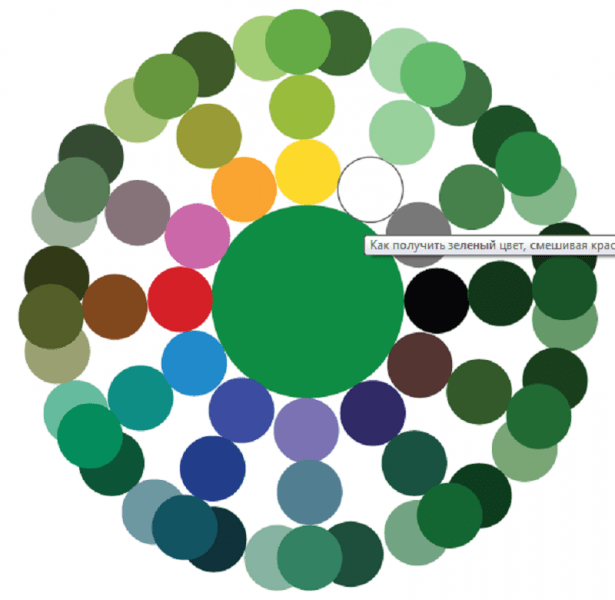
As in the case of the red circle, the main paint is located in the center, followed by mixing options, then the result of the experiments. The final circle is the shades of the previous level when adding the main, white or black paint.

Other combination options
There are many other tricks to create the desired effect by adding some kind of dye to the base color. The answer to the question of how to get ivory color is multifaceted and depends on the surface where the paint is planned to be applied. The easiest option is to mix a snow-white base base with a yellowish one. For example, yellowish ocher or a minimal amount of strontium is added to whitewash. To tint paper, a small amount of potassium permanganate is diluted in water. A light pink shade indicates a properly diluted solution. A cotton swab, brush or sponge is wetted in the resulting composition, after which the surface of the paper is processed.
Advice! For double-sided tinting, the sheet can be lowered for a couple of minutes into a container with a solution of potassium permanganate. After drying, it will acquire the desired effect of ivory.
There are also several ways to get black:
- by mixing the three basic colors of red, blue and yellow;
- when combining cyan, magenta and yellow;
- by combining green and red, but the result will not be 100% clear, but only close to the desired effect.

We will try to answer the most popular questions about mixing options:
- How to get a crimson color: the base is blue with the addition of red, white and brown.
- You can get turquoise, the second name of which is aquamarine, by mixing blue and green. Depending on the proportions, the tones of the new shade range from soft pastels to intense and bright.
- How to get yellow? It belongs to the main ones and it is impossible to obtain it by combining other paints. Something similar to yellow can be created with watercolors by combining green and orange or red. But it is impossible to achieve purity of tone in this way.
- How to get brown shade? To do this, you need basic paints: red, yellow and blue. First, a small amount of yellow is added to the red (in an approximate ratio of 10: 1), then the volume is gradually increased until an orange tone is obtained. After that, they proceed to the introduction of the blue element, 5-10% of the total volume will be enough. Minor adjustments to the proportions will produce a wide variety of brown effects.
- The combination of black and white elements in various proportions gives a diverse range of gray tones.
As you can see, there are countless options to achieve the desired effect in the creative design process. A table with options for mixing colors and videos will supplement the information provided:
Two color mixing charts
The color mixing table allows you to find out how to get the right one when mixing two or more colors and shades.
Such a table is used in various fields of art - fine art, modeling, and others. It can also be used in construction when mixing paints and plasters.
Color mixing table 1
| Required color | Primary Color + Mixing Instructions |
| Pink | White + add some red |
| Chestnut | Red + add black or brown |
| royal red | Red + add blue |
| Red | Red + White for lightening, yellow for orange red |
| Orange | Yellow + add red |
| Gold | Yellow + a drop of red or brown |
| Yellow | Yellow + white for lightening, red or brown for a darker shade |
| pale green | Yellow + add blue/black for depth |
| grassy green | Yellow + add blue and green |
| Olive | Green + add yellow |
| light green | Green + add White yellow |
| Turquoise green | Green + add blue |
| bottle green | Yellow + add blue |
| Coniferous | Green + add yellow and black |
| Turquoise blue | Blue + add some green |
| White-blue | White + add blue |
| Wedgwood blue | White + add blue and a drop of black |
| royal blue | |
| Dark blue | Blue + add black and a drop of green |
| Grey | White + Add some black |
| Pearl gray | White + Add black, some blue |
| medium brown | Yellow + Add red and blue, white for lighter, black for darker. |
| Red-brown | Red & Yellow + Add blue and white for lightening |
| golden brown | Yellow + Add red, blue, white. More yellow for contrast |
| Mustard | Yellow + Add red, black and some green |
| Beige | Take brown and gradually add white until a beige color is obtained. Add yellow for brightness. |
| Off-white | White + Add brown or black |
| Rose gray | White + Drop of red or black |
| Grey-blue | White + Add light gray plus a drop of blue |
| Green gray | White + Add light gray plus a drop of green |
| gray coal | White + add black |
| lemon yellow | Yellow + add white, some green |
| Light brown | Yellow + add white, black, brown |
| Fern green color | White + add green, black and white |
| forest green color | Green + add black |
| emerald green | Yellow + add green and white |
| light green | Yellow + add white and green |
| Aquamarine | White + add green and black |
| Avocado | Yellow + add brown and black |
| royal purple | Red + add blue and yellow |
| dark purple | Red + add blue and black |
| tomato red | Red + add yellow and brown |
| Mandarin, orange | Yellow + add red and brown |
| Reddish chestnut | Red + add brown and black |
| Orange | White + add orange and brown |
| red burgundy color | Red + add brown, black and yellow |
| Crimson | Blue + add white, red and brown |
| Plum | Red + add white, blue and black |
| Chestnut | |
| honey color | White, yellow and dark brown |
| Dark brown | Yellow + red, black and white |
| copper gray | Black + add white and red |
| eggshell color | White + yellow, a little brown |
| Black | Black Use black as coal |
Color mixing table 2
Mixing paints
black= brown + blue + red in equal proportions
black= brown + blue.
gray and black\u003d blue, green, red and yellow are mixed in equal proportions, and then one or the other is added to the eye. it turns out you need more blue and red
black= you can mix red, blue and brown
black= red, green and blue. You can also add brown.
bodily= red and yellow paint .... just a little. After kneading, if it turns yellow, then add a little red, if it turns pink, a little yellow paint. If the color is very saturated, add a piece of white mastic and knead again
dark cherry= red + brown + some blue (cyan)
strawberry\u003d 3 parts pink + 1 hour red
Turkish\u003d 6 hours sky blue + 1 hour yellow
silver gray= 1 hour black + 1 hour blue
dark red= 1 hour red + a little black
rust color\u003d 8 hours orange + 2 hours red + 1 hour brown
greenish\u003d 9 hours sky blue + a little yellow
dark green= green + some black
lavender\u003d 5 hours pink + 1 hour lilac
bodily= a little copper color
nautical=5h blue + 1 hour green
peach=2h. orange + 1h. dark yellow
dark pink=2h. red + 1 hour brown
Navy blue=1h. blue+1h Lilac
avocado= 4 hours yellow + 1 hour green + a little black
coral\u003d 3 hours pink + 2 hours yellow
gold\u003d 10 hours yellow + 3 hours orange + 1 hour red
plum = 1 hour purple + a little red
light green= 2 hours purple + 3 hours yellow
red + yellow = orange
red + ocher + white = apricot
red + green = brown
red + blue = violet
red + blue + green = black
yellow + white + green = citric
yellow + cyan or blue = green
yellow + brown = ocher
yellow + green + white + red = tobacco
blue + green = sea wave
orange + brown = terracotta
red + white = coffee with milk
brown + white + yellow = beige
light green=green+yellow, more yellow,+white= light green
lilac=blue+red+white, more red and white, +white= light lilac
lilac= red with blue, with red predominating
pistachio paint obtained by mixing yellow paint with a small amount of blue
Hair coloring is based on a scientific basis - knowledge of color and chemical laws, the skill of a hairdresser-colorist.
Coloring is divided into several varieties, the main of which are:
- booking;
- highlighting;
- balayage;
- ombre.
When blonding, the master carefully distributes various shades of light tones over the entire length of the hair of each strand. This look looks beautiful on blond hair.
Bronding on light brown straight hair. Results before and after staining
Performing hair highlighting, the hairdresser discolors the selected strands. The number of light strands depends on the wishes of the client and can range from 10% to more than 50%.
 Highlights on dark hair
 Sometimes for colored strands, the shades obtained during dyeing are additionally neutralized by applying the rules of color.
When carrying out the ombre technique, the master achieves a smooth transition, starting from a very dark root zone to the most lightened ends of the hair.
 Long straight hair dyed with ombre
 Features of coloring by color types of appearance
To obtain the desired tone, the paint is diluted with certain pigments:
1 pack of paint (60 ml) corrects the color with 4 grams of pigment. When you get an ugly or not the one that is desirable, experts do not recommend lightening the hair color, you get a dirty, unattractive color.
In this case, it is better to correct staining with professional craftsmen who have rich experience and the necessary funds.
Why is it important to know color theory, about color combinations, how to apply it in coloring
It is important to know! For hair coloring, mixing paints and colors, it is important to select matching tones, to combine them in exact proportions. Professionals mix paints that are similar in tone, meeting the rules for proper combination:
- copper shade with brown;
- eggplant with dark purple;
- caramel with golden brown.
It is not allowed to mix more than 3 colors of different tone. The hairstyle will gain contrast if white strands are applied to dark hair.
Note! Proper mixing of paints and colors in coloring can visually change the shape of the face, correct parts of the hairstyle with certain color shades.
Rules for mixing paints of different shades
Experienced professionals who know how to evaluate:
- hair - condition, structure;
- scalp - sensitive, dry, irritated.
Experts note 4 color types: cold - summer and winter, warm - autumn and spring.
it is undesirable to change the natural color type to the opposite.
For fair-haired women belonging to the “summer” color type, it is better to color with wheat, ashy and platinum tones. Dark-haired representatives of the fair sex belonging to this color type will suit various brown tones.

Blond hair of the “spring” color type is dyed with colors that match the natural color, golden and honey tones. For dark hair of this color type, caramel and walnut are chosen.
Bright representatives of the "autumn" are especially suited for rich tones of colors - red, golden, copper.
Experienced stylists determine the color scheme of hair dyes by the eyes.
 Owners of gray-blue eyes are most suitable for light hair tones.
 Green-eyed women are offered warm shades. If yellowish blotches are present in the iris, an orange and red palette paint is recommended. If the eyes differ in a malachite shade, a chestnut, dark blond tone is in harmony.
Light tones look beautiful with blue eyes. Brownish blotches on the iris of blue-eyed individuals suggest staining with caramel or red hues. Bright blue eyes - brown tones work well. Gray-blue is best painted in light colors.
For dark brown eyes with dark skin- chestnut or chocolate tones. If you have light skin with dark brown eyes, you should paint with red shades. For light brown eyes, golden tones are recommended.

Gray-eyed women fit all tones, but it is better not to use too dark shades.
Hair colors are mixed with palette colors similar in tone, accurate selection is carried out using the attached color shade tables.
Do not mix paints produced by different companies.
Manufacturers have their own palette, different from others. The desired result is obtained with the correct calculation of the proportion and amount of paint.
Experts recommend unevenly dyed and gray hair - first dye it in a natural color, and then select and mix shades. On hair of different types and textures, the same shades look different, and time exposure affects color saturation.
It is forbidden to dilute paint in metal dishes, suitable for glass, ceramics, plastic.
In what proportions to mix paints
Different amounts of dye are used on hair of different lengths:
- short hair - 1 pack (60 ml);
- medium hair - 2 packs (120 ml);
- long hair - 3 packs (180 ml).
To obtain the shade indicated on the package, 3% oxidizing agent is added when diluting the paint. When mixing paints for hair coloring, take them in equal proportions or add more paint, the color you want to get.
For example, when mixing caramel and golden blond, adding more golden blond, you get a richer golden hue.

Important to remember! The palettes of colors developed by the manufacturers are paints of complex tonality, containing different quantitative content of pigments: gray-green, blue, red and yellow.
The molecules of these dyes vary in size:
- The smallest molecule belongs to the gray-green pigment, coloring the hair, it is distributed in it first.
- Next in size is blue, which will be the next to take place in the structure of the hair.
- Red is larger than the first two, it has little opportunity to take place in dyed hair.
- Most of all, the yellow pigment, it has no place at all in the inner part of the hair, it envelops its outer side. Shampoo removes yellow pigment quickly.
The composition of dyes - what is important to know?
Undyed natural hair contains 3 primary colors. Their different combination determines the natural color of the hair.
 Three primary natural colors: blue, red and yellow
 In hair coloring, when mixing paints and colors, the gamut of colors is distributed over levels from 1 to 10: starting from 1 - very black and ending at 10 - the lightest. In hair from level 8-10 there is 1 yellow pigment, from level 4-7 there is red and yellow color, brown shades are obtained.
The highest levels 1-3 have the presence of blue pigment in conjunction with red, yellow is completely absent.
Hair dyes of all manufacturers are indicated by numbers, they determine its tone:
- the first - belonging to the degree of lordship;
- the second - to the main color (up to 75% of the paint composition);
- the third is the nuance of color.
secondary colors
Mixing bordering colors acquire secondary:
- orange - yellow and red;
- purple - red and blue;
- green - blue and yellow.
Each of the 3 primary colors has an opposite color (opposite color), contributing to the neutralization of various shades:
 Each of the 3 primary colors has a counter color
 - red is extinguished by green;
- blue - orange;
- yellow - purple.
Professionals calculate and remove unsuccessful shades according to this principle.
Tertiary colors
By connecting the primary and secondary color borders, they acquire tertiary shades.
When coloring hair, mixing paints and colors, beautiful shades are obtained, for example, by combining a beige shade with a cold violet - exquisite platinum. A blonde with gray-green hair is corrected by adding red, redness is neutralized with a tobacco tint.
Important to remember! On completely bleached hair, the desired shades are not obtained, they become lighter, for example, a purple tint on white hair turns into lilac. With a slight content of yellow pigment in the hair, it comes out:
- Pink color takes on a reddish tint.
- Lilac neutralizes yellowness, platinum remains.
Darker shades come out on natural uncolored hair.
Harmonious colors
The harmony of nearby colors is the presence of one primary color. Harmonious colors are taken from the intervals of one main color to the next main color. They have 4 subspecies.
The harmony of these colors leads to balance, changing their lightness and saturation when coloring hair, mixing colors and colors. When white or black colors are added to them, the harmony of the combination occurs with the release of one saturated color.
 The Oswald circle is the basis of coloristics, which determines the laws of the formation of shades. Mixing dyes and colors to change hair color is carried out in accordance with his recommendations.
 monochrome colors
With a monochrome combination, a combination of colors of the same color range occurs, with light and saturated shades. In hairdressing, a similar calm combination is often used.
achromatic colors
The achromatic combination of colors is essentially close to the monochromatic combination; in some sources it is not singled out separately. It is based on two or more achromatic colors.
The classic combination of this harmonic series is considered to be a gradual transition from white to black. Hairstyles made in this style emphasize dignity and stability.
 Achromatic color combination
 Each manufacturer produces complex color shades using different proportions, which gives the product its own shade.
Some companies add a neutralizing pigment, but not always. The complexity of staining to obtain the desired effect is to carefully study the composition of the paints.
Ash shades
Ash shades are popular in hair coloring in salons, especially with ombre.
The results of staining with ashy shades may differ from those expected. Therefore, a number of nuances should be taken into account :
- ashy shade on bleached hair looks excessively gray or dirty;
- it gives darkening to the hair;
- in the presence of yellowness creates a green tint;
- suits young girls, other women look older.
 Ash shade is most suitable for young girls
 Skillful hands of a professional will avoid side effects and get the desired result, taking into account the following features of ashy paint:
- there is a lot of blue pigment in the ashy shade;
- a feature of the paint is the presence of different shades from different manufacturers;
- ashy shades of different firms differ in pigment density;
- this paint removes the orange tint when lightening.
Before proceeding with the coloring of hair, you should determine a few points:
- correctly set the depth of the tone in the hair;
- understand what hair color the client wants to receive;
- make a decision about additional hair lightening;
- understand whether after the procedures an unnecessary shade to be neutralized is obtained, and determine the color.
 It is important to correctly determine the level of depth of hair tone
 Hair coloring, mixing several colors of different colors in a hairstyle contributes to the creation of a unique individual image. This type of coloring is suitable for hair of different lengths: from short creative haircuts to beautiful curls.
Experts insist on maintaining a sense of proportion so that there are no overflows of tasteless bright spots. The theory of color, an invaluable practice that brings experience, helps the masters to maintain balance.
Qualified hairdressers warn - you can not rashly experiment without a clear knowledge of the laws of obtaining color combinations.
 Hair Color Mixing Chart
 How to properly dye your hair using the color technique
Before coloring hair, mixing paints and colors, follow the advice of experts:
- It is not recommended to use masks for a week before dyeing, as the special substances in their composition envelop the hair and can change the expected coloring result.
- The head is not washed before staining: the skin on the head will not be affected by the oxidizing agent, due to the released fat.
- Paint is applied to dry hair, wet dilute it, the color will lose saturation.
- To facilitate the distribution of the dye, the hair is divided into strands and the dye is applied evenly and quickly.
- The paint is applied again, first on the root zone, after 20 minutes, spread over the entire length.
- Perform the procedure with gloves that protect your hands.
- Wash off the paint gradually, moisten, lather. Then wash your hair with shampoo and apply balm.
Paints must be for professional use and belong to the same manufacturer .
Mixing paints and colors in hair coloring should be carried out step by step:
- Read the instructions carefully. Mix colors separately.
- Mix paints together in the chosen proportion.
- Mix composition thoroughly and distribute the mixture through the hair. The paint is applied immediately after preparation, because. the shelf life of the diluted coloring composition is short.
- keep hair dye according to the instructions, then wash your hair.

Note! divorced and mixed paints cannot be stored. After 30 minutes, a reaction with air masses will occur and the paint will deteriorate. A multi-colored mixture should be used in one go.
The records determine:
- the color you like, no need to remember - what shades were used when mixing;
- duration - how long the staining is not washed off;
- unsuitable shade - which colors should not be mixed.
Professionals warn – it is difficult to get rid of some tones of colors. First you need to remove the color you don’t like, and then dye your hair again. These actions will affect the condition of the skin on the head and hair.
After consulting with experts, you can understand which colors are more suitable for skin type and face shape and find a special individual hair color that emphasizes the unique female image. Be healthy and beautiful!
Useful video materials on the topic: Hair coloring. Mixing paints and colors
How to mix hair dyes correctly:
A short course on the basics of color:
You can see how to choose a shade for your hair here:
When choosing paint for interiors, even for watercolors, it is easy to make a mistake with a shade. Paper testers may not match the tone in reality.
Don't worry, there is a way to achieve the desired shade! Read on to find out what colors to mix to get blue.
In contact with
Creating a classic shade
Unfortunately, which components were not mixed, without the primary tone itself, it will not even be possible to come close to creating the necessary shade. .
Red and yellow colors follow the same rule.
If the color in your palette is too dark, then white paint will help to lighten it by several tones.
If, on the contrary, it is necessary to darken the shade, then more dark tones should be added to the mixture - black, gray or brown.
Important! If you are mixing colors to create a small pattern in the interior, then you can mix them in a small bowl by hand. If you want to paint an entire wall, tint the ingredients in a bucket with a builder's mixer.
How to keep proportions
How to get blue when blended:
- Get a delicate ultramarine by mixing the blue and white parts in a 3:1 ratio.
- To create a shade with a slight blueness, increase the amount of white color. The ratio of blue to white is 2:1.
- For a more transparent, light tone, stir them in equal proportions.
WITH advice! The sky color is perfect for painting a boy's nursery.
A turquoise tone will help to get a more intense heavenly tone.
A complex recipe of three ingredients will help create the color of the sea wave. How to make blue with turquoise and white? Take 2 parts blue paint, 1 part white and turquoise. Enjoy the sea blue.
This is interesting! Red, blue, yellow - are called primary, because by mixing other tones it will not be possible to achieve the desired shade. Why do you need to know what colors to mix to make blue? To achieve a play of shades and original textures, create artistic masterpieces.
dark shade
 In the case when you want to make the color darker, the mixing recipe is a little more complicated. It all depends on what final result and how rich tone you are trying to achieve. How to successfully mix different tones to get a dark blue color:
- You will need two colors: black and aquamarine. If the tone is made to decorate details, then stir the mass with a brush or stick in a small container. To paint the walls, it is necessary to tint the shade with a construction mixer, a special attachment for the grinder.
- There are no exact proportions. Add black color to the base paint drop by drop or a few milliliters.
- The resulting mixture is best tested on a sheet of white paper and allowed to dry. If the shade suits you, then stop tinting. If not, add even more black.
Advice! Darkened? Lighten the mass by several tones with white. Mix in gradually so you don't have to add black again.
Violet
Ultramarine is similar to artificial, which is not found in nature. Violet will help create a paint color of a dark sky. Magic coloring will help create an interesting tone that can be used to paint the ceiling in the nursery, and bright glowing star stickers will create an imitation of the night sky. How to get blue from purple:
- Mix blue paint with purple in proportions 3:1.
- For the ceiling, knead the dye with a construction hook for about 10 minutes.
- Test the finished mass on a small section of the wall. Do not forget that you need to apply interior color in 2-3 layers.
 Favorite female shade is royal ultramarine.
To get such a noble tone on the verge of night blue and sea waves, you need an acid purple color scheme or pink. The recipe is similar to the previous tinting:
- You will need 2 tones: acid violet (pink) and ultramarine.
- The proportions of blue and pink are 3:1. Sometimes a little more pink is needed.
- Evaluate the result by applying the dye to a small area.
Advice! To get purple, mix red and blue in equal proportions.
From yellow
To create an emerald blue color based on ultramarine, you need yellow. The resulting shade is similar to the brilliance of precious stones. It is appropriate to use it for decorating small elements to get a fantastic picture. How to get blue from yellow:
- Mix yellow and ultramarine colors in equal proportions.
- For a pastel look, add white. The proportion recipe depends on the desired degree of pallor.
Advice! To create a fantastic color with overflow, do not mix the paint thoroughly. A lazy way of tinting will create an interesting mother-of-pearl effect.
From green
 Prussian blue is a favorite of not only interior designers, but also clothing.
Deep color is associated with the depths of the sea and a distant galaxy. How easy it is to get blue from green:
- We combine two colors: aquamarine and green in equal proportions.
- Mix using the technique for a uniform texture.
Surprisingly, when the third white ingredient is added, the color does not fade.
How to make the right shade of paint
What if there is no main color scheme, but you need to make blue paint? An interesting tone, similar to sapphire brilliance, is obtained by mixing red and green. Such tinting will not give a pure ultramarine, but with the addition of black and white paint, interesting and unusual shades can be achieved.
Color prices
Useful video: how to mix colors
Combine combinations of warm shades with delicate pastels, blue tones- with cold ones. Change the proportions to your liking, competent tinting is the key to a successful repair. Experiment and create your own colors!
When decorating the surfaces of walls, furniture and other objects with paint, the question arises of mixing them to obtain the desired color. It is not always possible to find the desired color or shade in stores, so you can use the mixing table. Creating color by hand from improvised paints is also cost-effective.
Features when working with acrylic paints
Acrylic paints are inexpensive, easy to work with and dry relatively quickly. But the disadvantage is a narrow palette of colors, so you need to create the desired shade manually. You can get burgundy, purple, turquoise, sand, wenge, lilac, and others by mixing colors.
There are some rules when working with acrylic:
- The surface to be painted must be smooth, clean, free of oil and grease. It must first be cleaned of the previous finish. It is not recommended to apply a new coat of paint on the old one;
- Before painting, the walls must be leveled with putty, and then apply several layers of primer. The primer is used for better adhesion of paint and for less consumption;
- Before use, acrylic must be diluted with water or special solvents, but it is better to do this in a separate container, with a portion of paint. This is necessary in order not to spoil the entire volume at once, but to use only as much as necessary.
- After work, the used rollers and brushes must be rinsed well with water, otherwise they will become unsuitable for further work. You also need to wash other tools that have been used. The top of the paint bucket needs to be wiped down so that the lid can be opened in the future.
- Most often, painting occurs in 2-3 stages, and for an effective result, you need to do it in one direction. To simplify and speed up the work, you can take a spray gun.
Important! Also, do not forget about the precautions, before work it is better to cover or seal all places and objects that will not be stained. You can work with the material at a temperature not lower than 5 degrees and not higher than 27 degrees.
Another main rule of application is to use paint first on a small area or a completely separate surface. When creating the desired shade, it is better to try it on a draft. You also need to wait until it dries completely, because after the color becomes a little darker or lighter, depending on the type of paint. And if the color matches the expected desired result, then you can start painting the surface or decorating objects.
What colors to buy
Tinting is the name of the science that studies mixing styles and getting the right shade. It is this science that helps to get lilac, as well as fuchsia, ivory, sea waves or seas when mixing colors. In theory, to create many colors, it is enough to have yellow, red and blue. But in this case, you can get a narrow spectrum.
To create a wide palette, it is enough to buy such colors:
- Red;
- Yellow;
- Brown;
- Pink;
- Blue;
- Black;
- White.
These colors are quite enough for applying the main scales. Gold, silver, mother-of-pearl and other additional colors are also used for decoration of drawings.

Mixing Features
You can find out how to mix and get the right shade by consulting with a specialist in the store when buying.
Tip: The main rule of mixing is that dry and liquid colors cannot be combined. They don't match.
There are 4 main colors - white, red, blue and green. With their help, you can get many others. For example, khaki can be obtained by mixing brown and green. And to get brown when mixed, you can from red and green. Beige - take brown and white.
Working with a table
Working with the table is to find the desired color and shade, and next to the line, the desired colors for mixing will be indicated. For example, you can get purple by mixing acrylic paints by mixing red and blue. And to make it light or dark, just add a little white or black color, respectively. The disadvantage of working from the table is that it does not indicate the amount of added pigment - the ratio. Therefore, when mixing, practice and color perception are needed.
Here you can simply take and mix colors first in the same proportion, and then add another for the desired shade. Or use specialized tables that have been developed by specialists for working with the material.
For example, to get an orange color when mixing acrylic paints, it is enough to mix red and yellow.
Acrylic Color Mixing Chart
|
Image |
Color name |
Required colors |
|---|---|---|
|
Grey |
White and black |
|
|
Plum |
Red, blue, black |
|
|
light green |
Yellow, white and green |
|
|
Dark-blue |
Blue and black |
|
|
Bordeaux |
Red, brown, yellow, black |
|
|
dark green |
Green and black |
|
|
Orange |
red and yellow |
Working with paints is easy, the only difficulty is creating the right shade, without proportions. But, if you understand the mixing table and practice, as well as know the rules for working with acrylic, you can create a unique and inimitable interior design with your own hands and relatively cheaply.